The most interesting autumn photographs often contain more than autumn’s familiar orange. Green remains at the edge of a canopy. A dark branch crosses a bright leaf. Water holds a cooler version of the trees above it. This collection is about those overlaps: change seen as a gradual, uneven arrangement.
Colour arrives in company
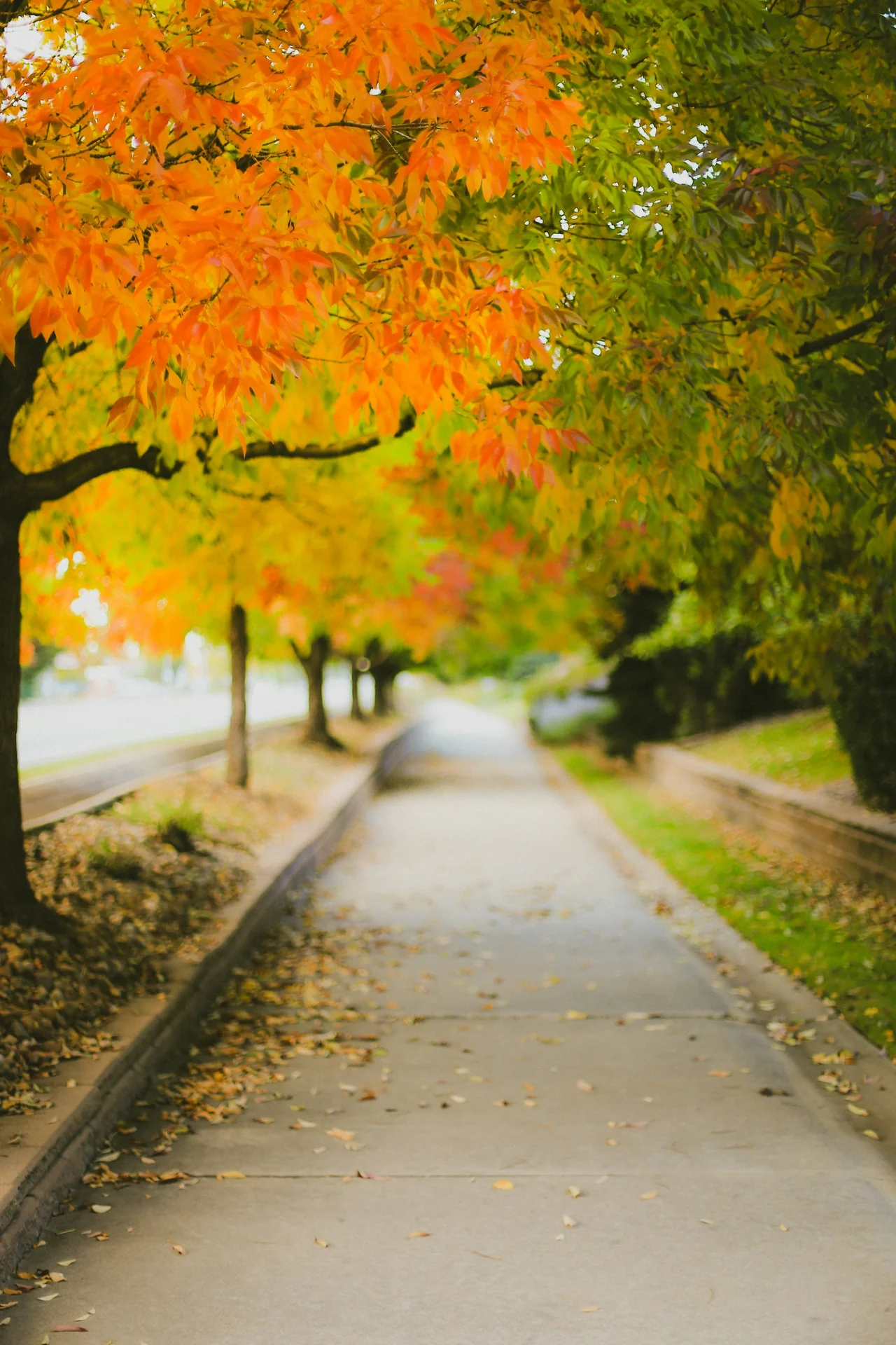
The path photograph contains several stages of colour in one frame. Warm leaves gather overhead, while green remains visible farther along the view. The ground is paler and less saturated. Because these areas are different in both colour and scale, the canopy feels full without occupying every part of the picture equally.
Try choosing a small patch of green and keeping it in mind as you look at the orange around it. The warm tones may begin to feel more vivid. That relationship is more useful than naming a single “autumn colour.” A palette is made by neighbouring surfaces, including the quiet ones that are easy to overlook.
A leaf has two kinds of edge
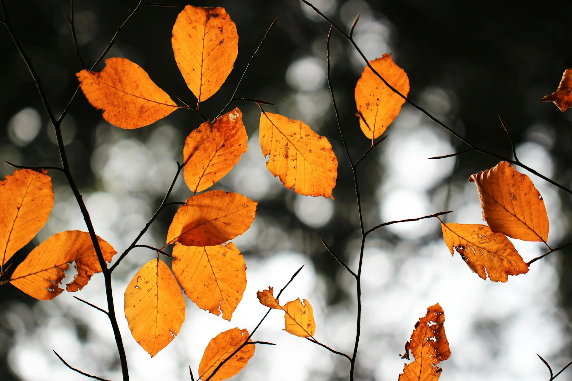
In the close photograph, the outer contour of a leaf is clear against the soft background. Inside that outline, smaller veins and uneven marks give the bright surface a second structure. The fine dark branch links several leaves while the spaces between them keep each shape distinct.
Light coming through a leaf can make colour feel unusually concentrated. Here the surrounding shadows are part of that effect. Looking only at the brightest area misses the arrangement that lets it stand out. Notice the near-black lines, the blurred pale circles behind them, and the little gaps where the background becomes visible between two leaves.
The reflection is a different picture
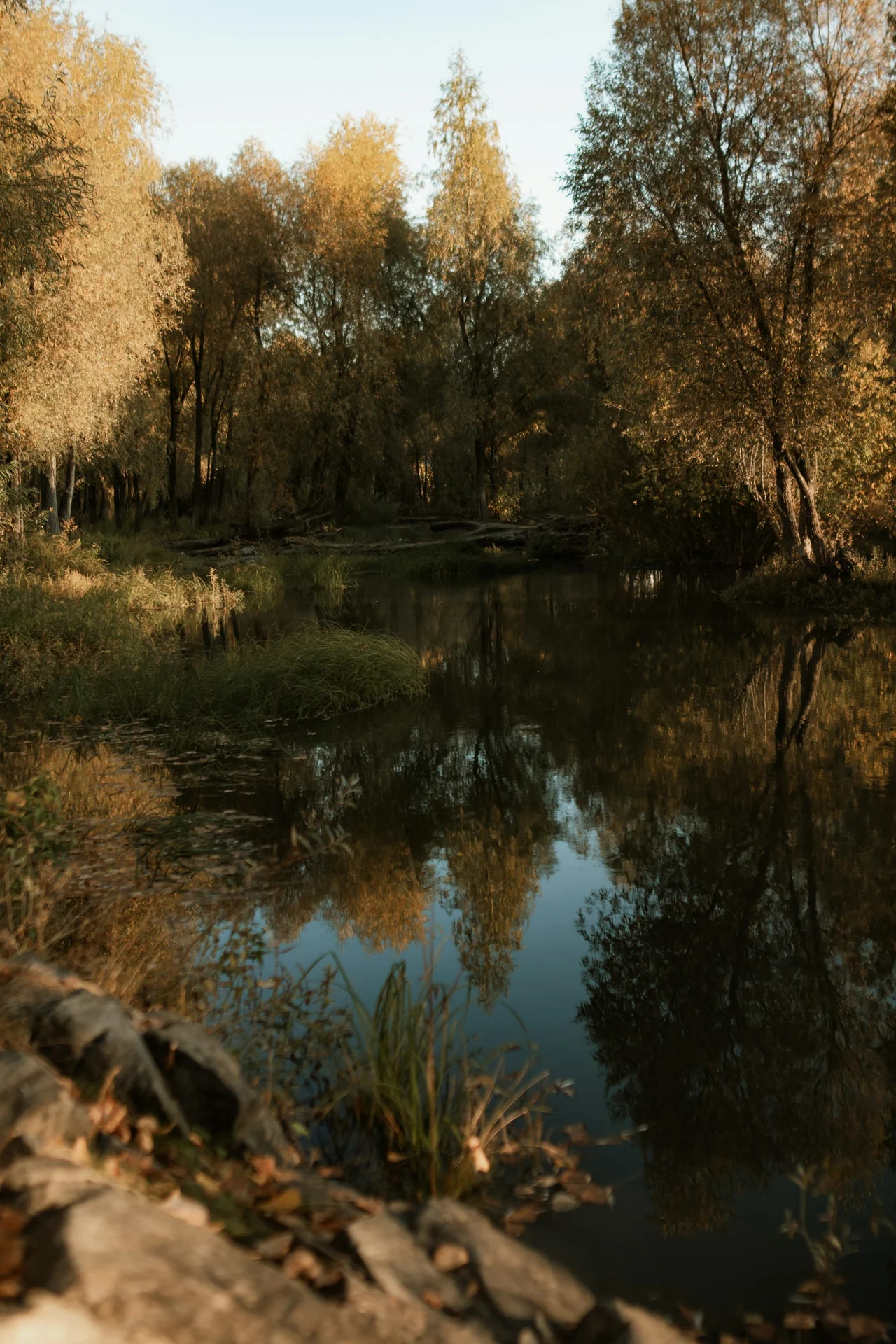
Water does not simply add a duplicate landscape. It changes the shape and contrast of the view. Some reflected details remain readable; others become long areas of dark colour. The waterline gives the picture a point of comparison, but the two sides do not need to match perfectly to feel connected.
Look at the upper and lower portions separately. Above the water, you may read branches and foliage. Below it, the same information can become a softer field of marks. The reflection is useful as an image in its own right. It adds a second pace to a woodland scene that might otherwise be read very quickly.
What remains beneath the colour
Imagine describing each of these autumn photographs to someone who cannot see its colours. The path still has a light centre and a canopy overhead. The leaf study still has a fine branching structure and clearly separated shapes. The water photograph still places one arrangement above another. These descriptions suggest how much of the composition remains when its most familiar seasonal signal is set aside.
Bring the colour back into the comparison. It now has a structure to work with, rather than having to explain the whole image by itself. A warm canopy encloses the path; a bright leaf occupies the end of a dark line; a reflection gathers several quieter tones into a lower field. This is a useful way to move beyond calling a picture simply colourful. Describe where the colour appears and what it allows you to see more clearly.
The ordinary route becomes a frame
A path gives the eye a direction. Its sides narrow toward the distance, and the overhead canopy makes an informal enclosure. The photograph can feel welcoming before we have examined any individual tree. That impression comes partly from the arrangement of edges, rather than from colour alone.
We are interested in that visual construction, not in presenting the scene as a place everyone should visit. A photograph cannot establish access, present conditions or the experience of being there. Here it offers something smaller and more lasting: an opportunity to see how a familiar route can become an image through light, distance and a changing frame of leaves.